Propbinder
A property management platform serving three distinct user groups: administrators, field operators, and tenants. Each with their own app, mental model, and stakes.
Overview
Three apps. One system.
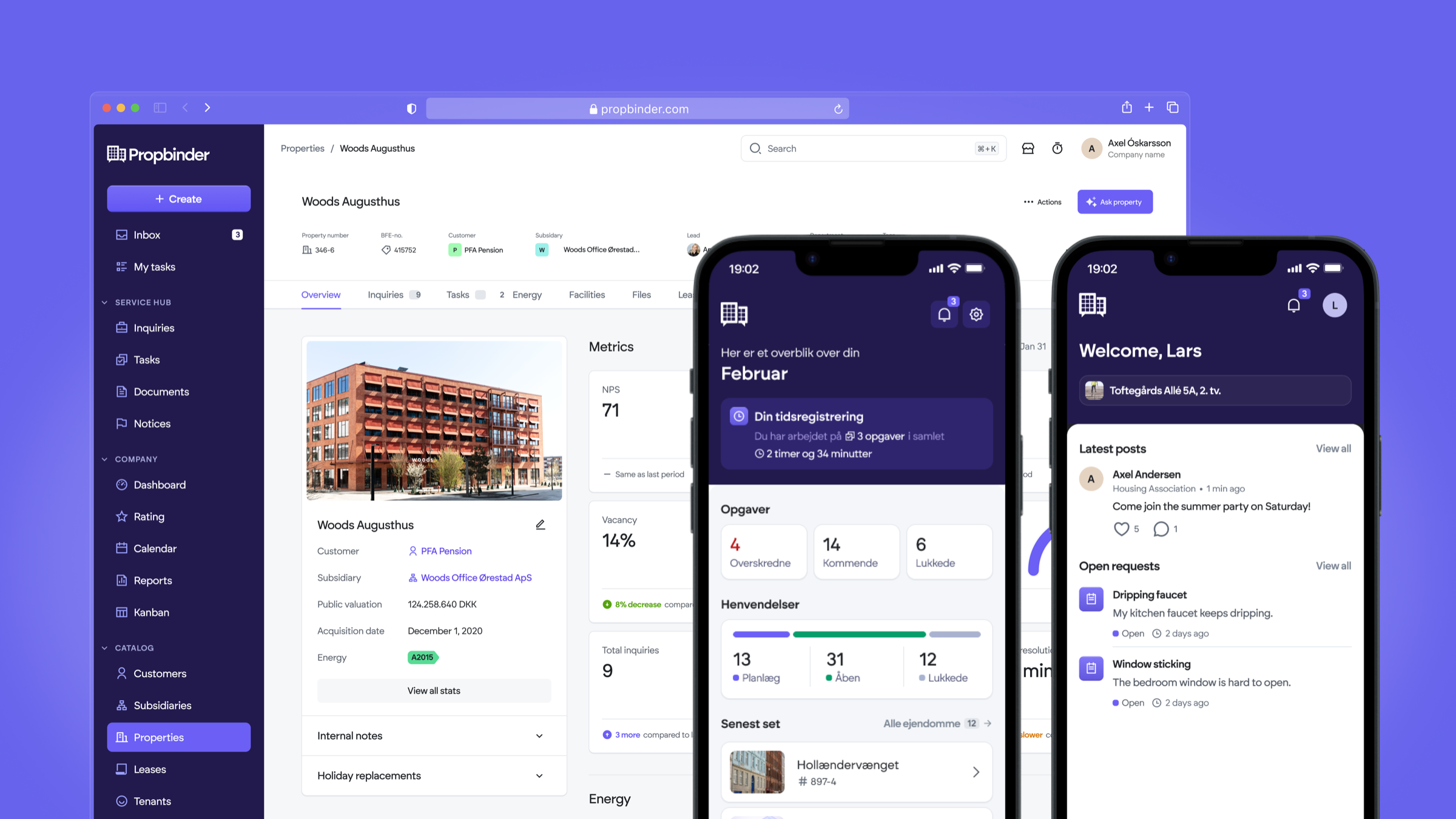
Propbinder is a property management platform built around three distinct user groups: property administrators who oversee portfolios, field operators who handle day-to-day maintenance and time tracking, and tenants who manage requests and communications.
Each group has its own dedicated application, with different needs, different mental models, and very different stakes. My work spanned all three, responsible for user research, flow redesign, and ensuring the system held together across contexts.
01
Admin app
Portfolio oversight, property management, tenant and operator coordination.
02
Operator app
Field work, maintenance tasks, time tracking and on-site reporting.
03
Tenant app
Service requests, communications, lease documents and payments.
Challenge
Coherence without uniformity
Designing for a multi-platform product means every decision has downstream consequences. A pattern that works for an admin doesn't necessarily work for an operator on a phone, in the field, under time pressure.
The core challenge was maintaining systemic coherence (shared logic, consistent role architecture, predictable behaviour) without flattening the specificity of each user's context.
Research
Understanding the real stakes
I conducted user interviews across all three platforms to understand not just usability friction, but operational consequences. The research surfaced a finding that changed how we prioritised the entire operator app.
The time tracking flow looked like a minor UX issue: a few extra taps, some unclear labels. But in context, it was a high-stakes daily interaction directly tied to payroll. Errors meant incorrect salary calculations. Once that was clear, the priority and design direction shifted entirely.
Process
Five decisions that shaped the system
Story 1From empty state to immediate value
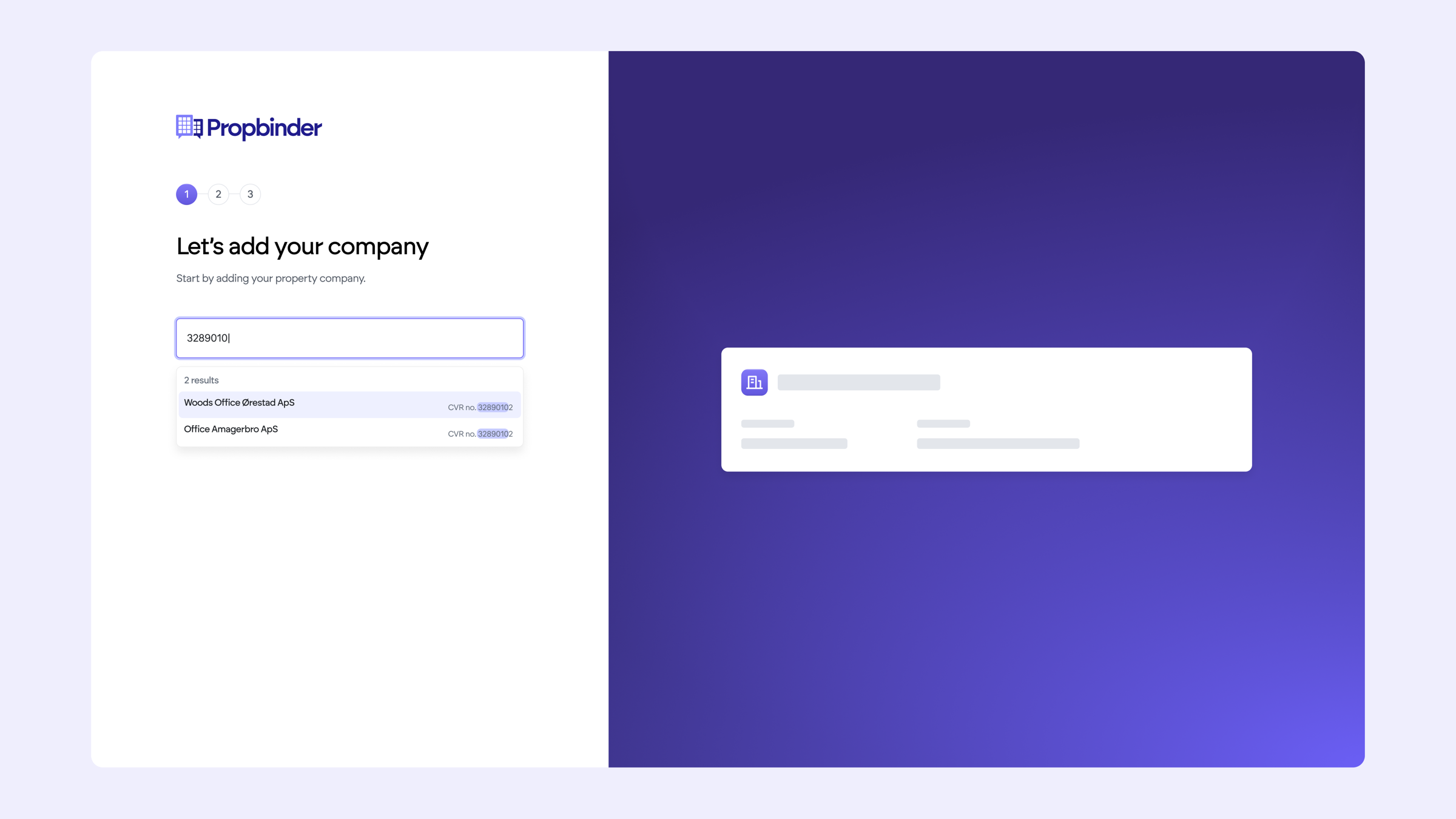
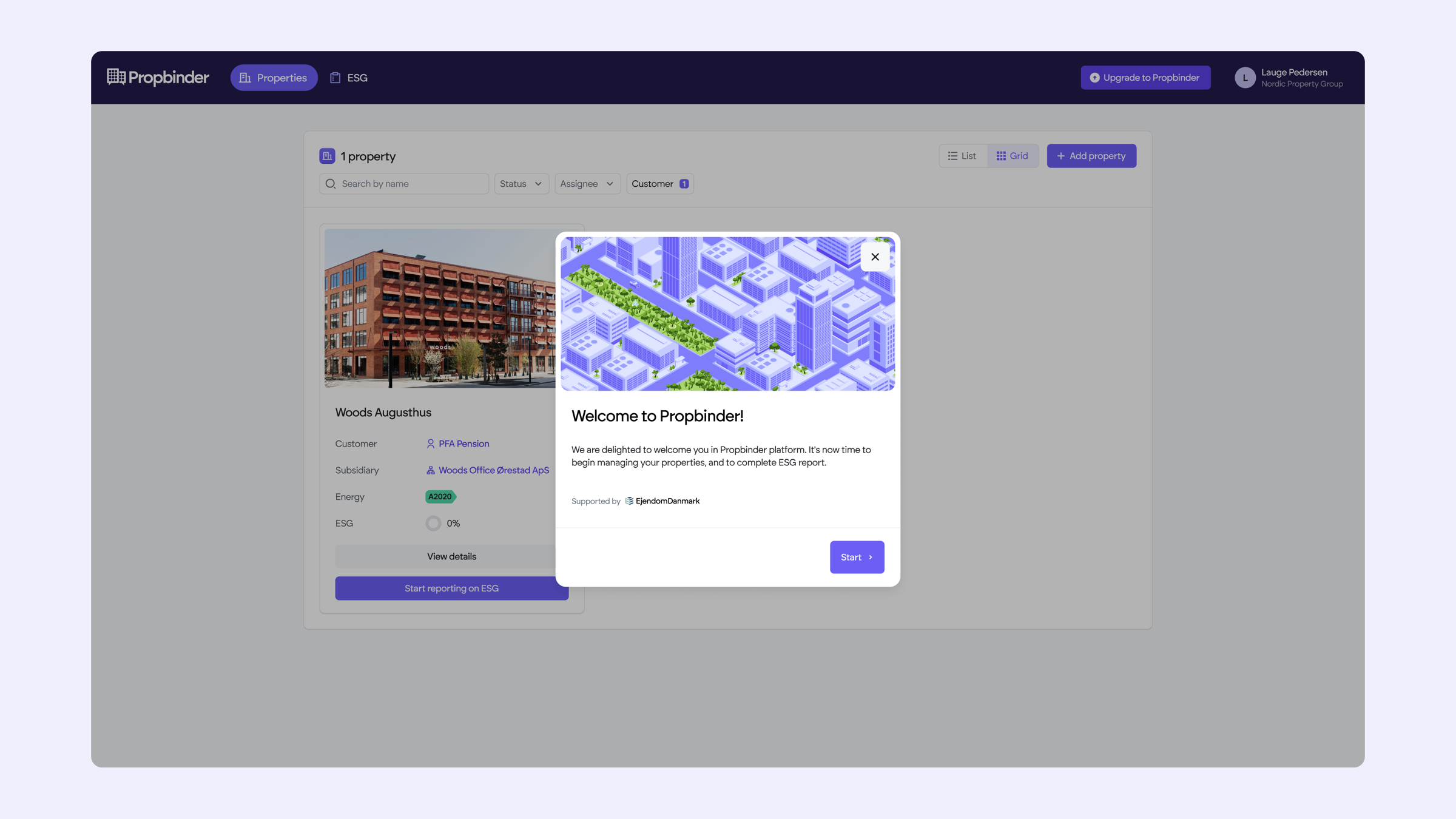
Property managers signing up for the first time typically land on an empty dashboard, a blank slate that signals "you have to build this from scratch." That gap between signing up and seeing value is one of the most common causes of drop-off in B2B SaaS. By leveraging CPR number lookup, the platform now retrieves existing property data automatically on signup. First-time experience becomes a pre-populated, meaningful dashboard within seconds.
Story 2Untangling the inquiry creation flow
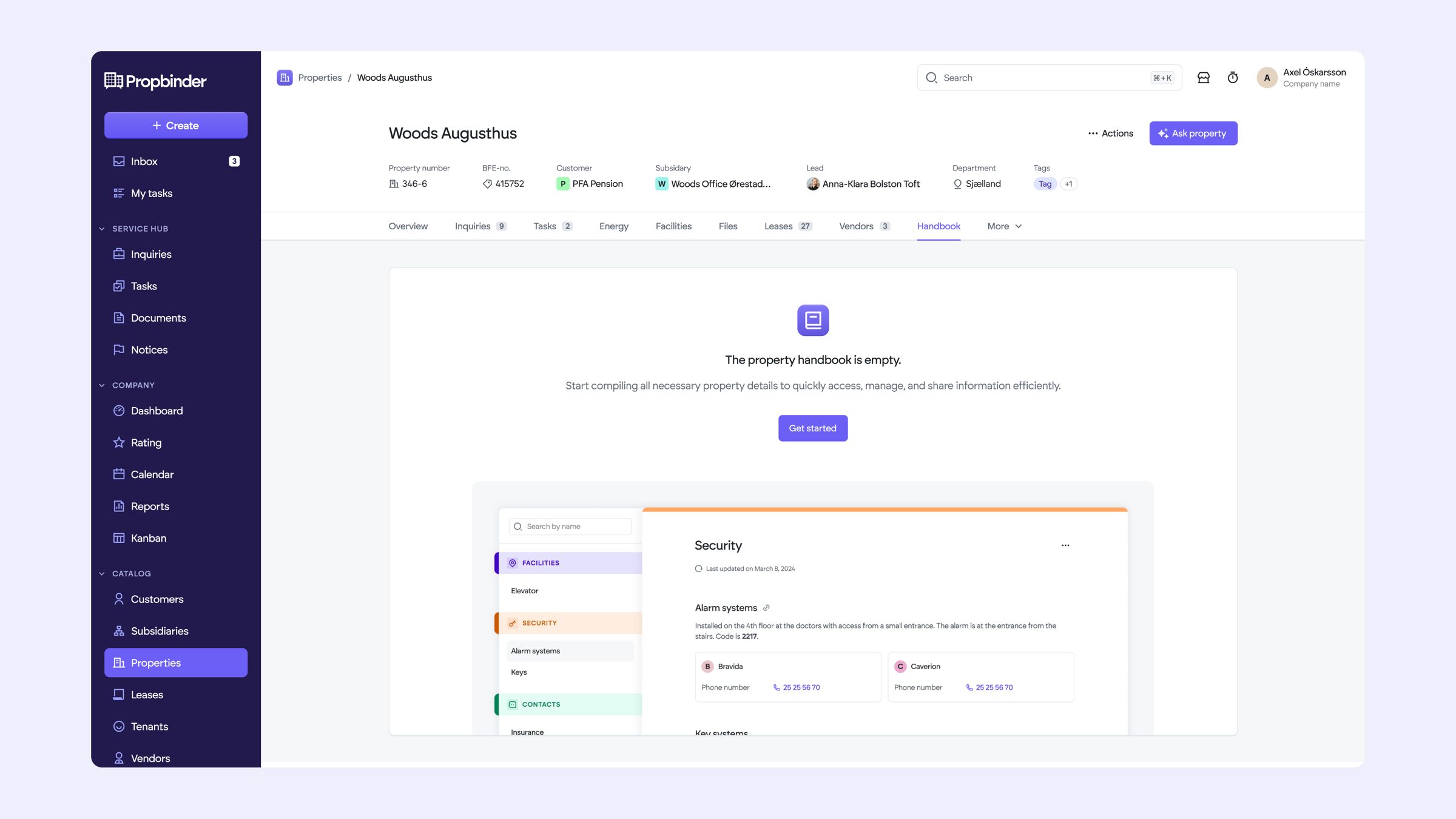
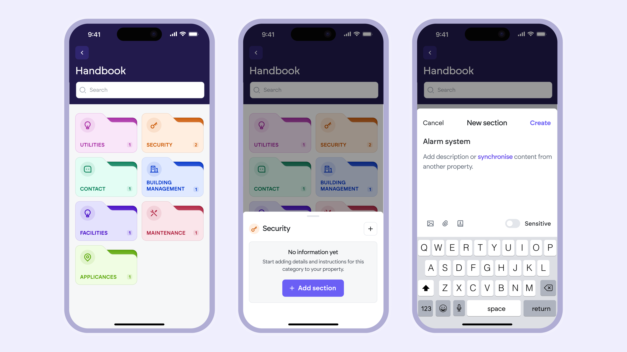
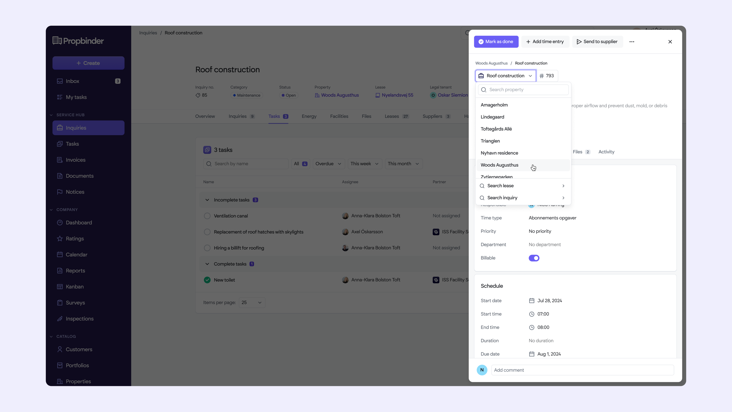
The core inquiry creation flow on the admin platform had become layered with edge cases and workarounds added over time. Each extra step was someone's fix to a problem the original flow didn't anticipate. I mapped every branch, found where decisions were being made twice, and redesigned the flow to reduce cognitive load at each step without losing the flexibility admins actually needed.
Story 3Mapping who can do what
One of the hardest systemic decisions was defining who can do what, and when, across three apps with overlapping but distinct permissions. Getting this wrong would create confusion at every touchpoint. We mapped role boundaries carefully, balancing flexibility for admins with clarity for operators.
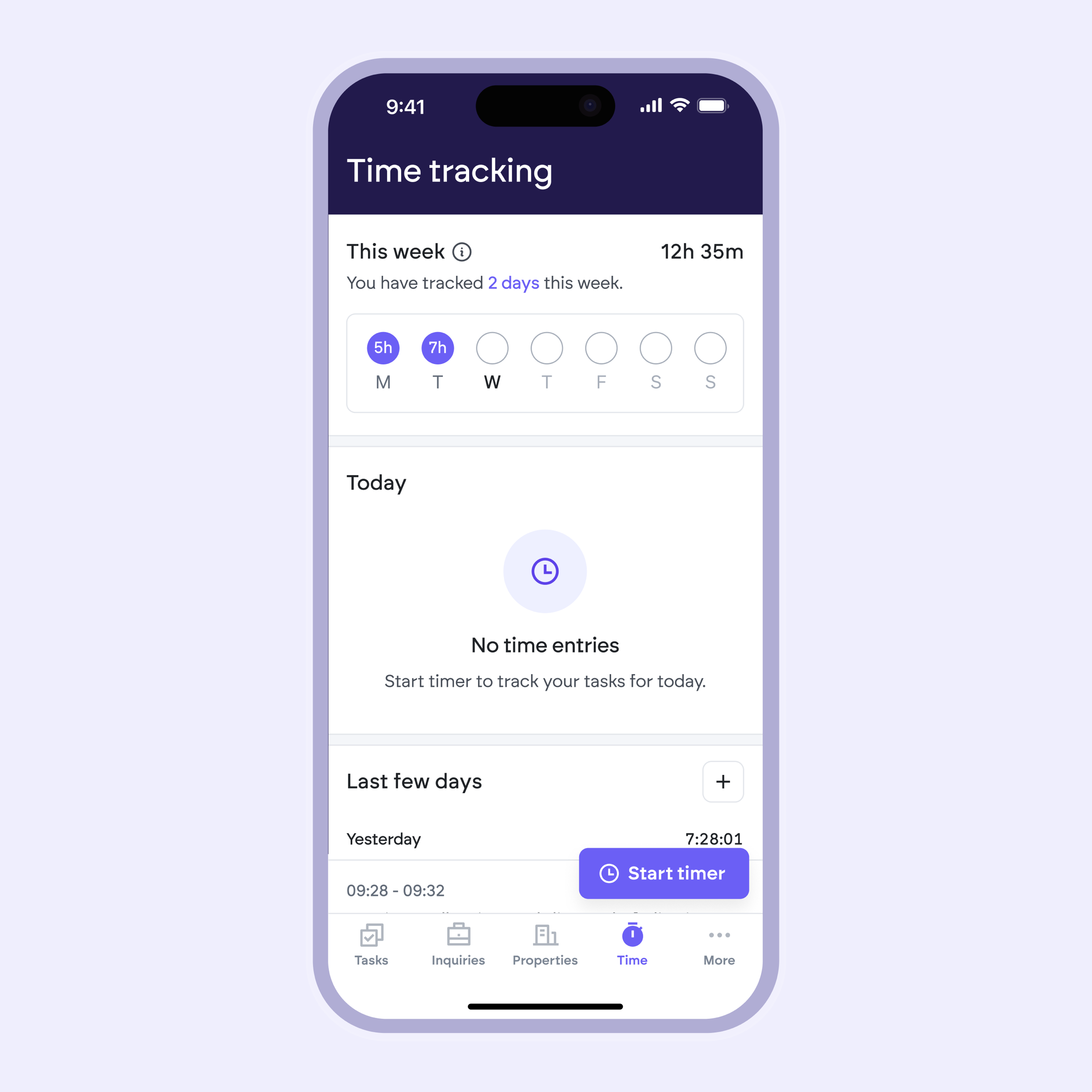
Story 4Time tracking tied to payroll
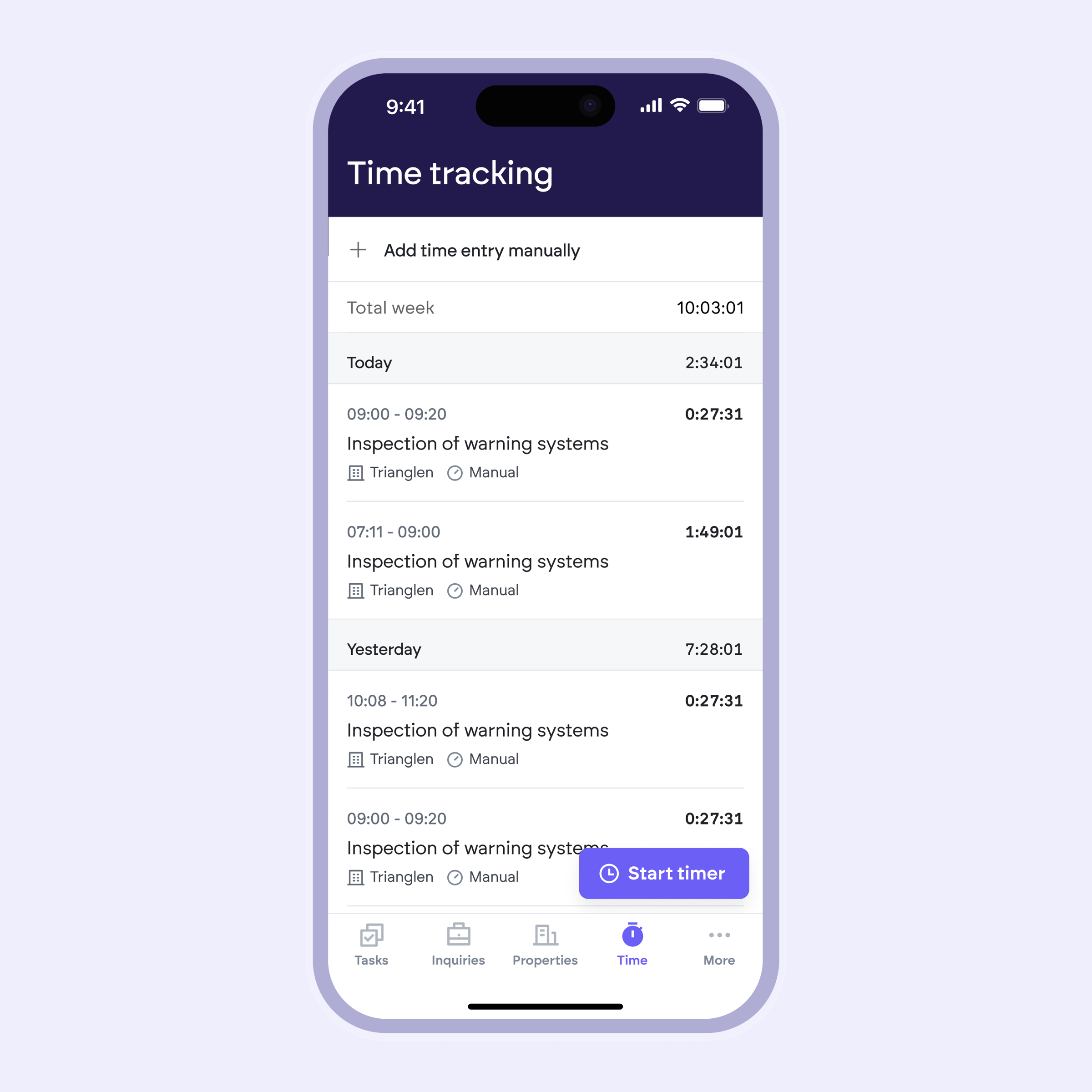
Research revealed that the time tracking flow wasn't a minor UX issue. It was directly tied to payroll. Errors meant incorrect salary calculations. Once that was clear, the priority shifted entirely. I rethought the operator flow from the ground up: reducing cognitive load for people working in the field under time pressure, surfacing weekly hours immediately rather than buried in menus, and making errors harder to make by default.
"I put my time here and this impacts my salary. Right now I can't access it directly and I can't see how much I worked during the week."
Story 5Instrumenting a white-label product
The tenant app is deployed by multiple companies under different brands. Without instrumentation, there was no way to know how usage differed across clients, or where to invest next. I integrated PostHog to track real usage patterns per deployment, enabling the product team to compare behaviours across clients, identify onboarding drop-off points, and prioritise improvements based on real data rather than assumptions.
Outcomes
The project improved the experience across three interconnected platforms while creating a stronger foundation for future product decisions.
Reduced friction from day one
The onboarding experience was redesigned to remove common setup barriers. Instead of landing on an empty workspace and manually creating properties, property managers now access a pre-populated dashboard on their first login thanks to CPR-based data retrieval. This transforms the first experience from configuration to immediate value.
Placeholder: Reduced onboarding from [X] to [Y] steps, increasing onboarding completion by [Z]%.
Building trust in a critical daily workflow
User research revealed that time tracking wasn't just another feature. It directly affected operators' salaries.
"I put my time here and this impacts my salary. Right now I can't access it directly and I can't see how much I worked during the week."
The redesigned flow gives operators immediate visibility over their weekly hours, reducing uncertainty and making a high-stakes daily task easier to complete with confidence.
Placeholder: Task completion improved by [X]% or average completion time decreased by [Y]% after usability testing.
A scalable design system across multiple user roles
By defining clear permissions and responsibilities across property managers, operators, tenants, and suppliers, the platform gained a more consistent interaction model while preserving each user's specific workflows. This systemic approach reduced design inconsistencies and simplified future feature development.
Data-driven product evolution
To support continuous improvement after launch, I implemented PostHog analytics on the white-label tenant application.
This enabled the team to:
- identify the biggest onboarding drop-off points;
- compare feature adoption across different client companies;
- analyse funnel completion rates;
- detect behavioural differences between deployments;
- prioritise future improvements based on real user behaviour rather than assumptions.
Placeholder: For example, 42% of users abandoned onboarding at step 3, leading to the next optimisation cycle.