Cloud Factory
Redesigning the Partner Portal for one of Europe's fastest-growing Microsoft cloud distributors. A new design system, a clearer product identity, and the tools partners actually need to grow.
Overview
The operational backbone of 800+ partners.
Cloud Factory sits between Microsoft and Managed Service Providers across 8 European markets. They handle license distribution, billing, and support so MSPs can focus on selling to their own customers. Their core product is the Partner Portal: the platform MSPs use every day to manage subscriptions, access support, and run their business.
EDL was brought in to redesign the portal from the ground up. The goal was to improve the experience for existing partners, support expansion into new markets, and position Cloud Factory as more than a Microsoft reseller.
Problem
Built around one vendor. Ready for many.
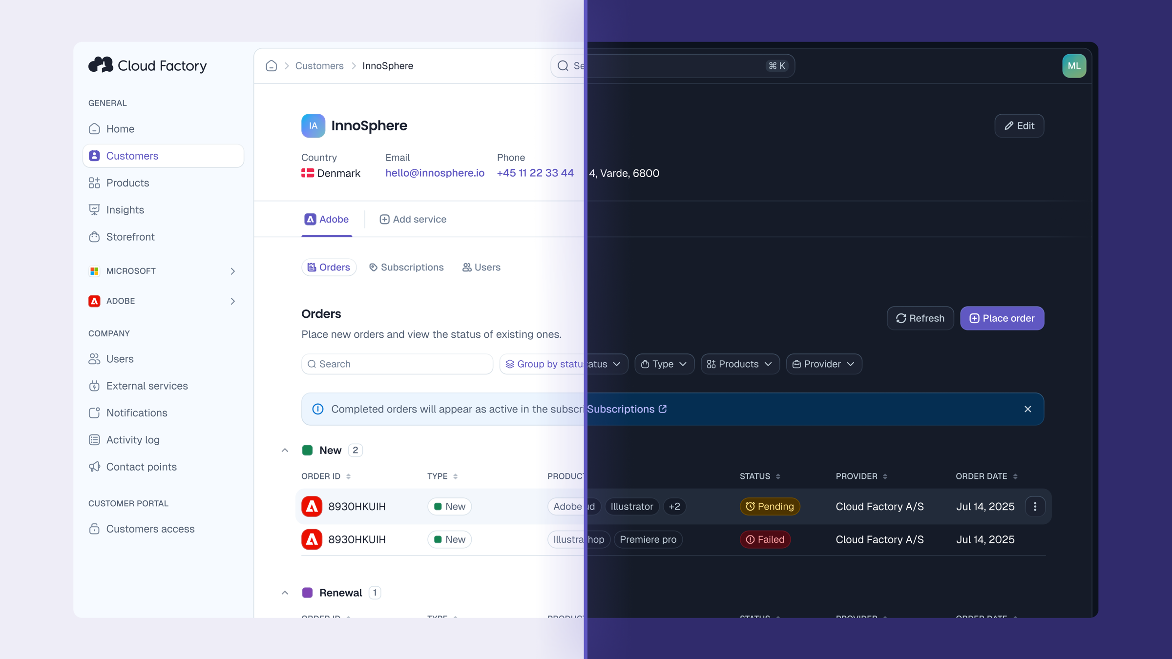
The existing portal had grown organically around the Microsoft product catalog. As Cloud Factory added vendors like Adobe, Acronis, and Dropbox, the interface didn't follow. The visual identity was inconsistent, the structure reflected a single-vendor logic, and there was no design system to build from.
Beyond the visual debt, a more operational problem emerged in user interviews: partners didn't have a clear picture of what was available, and they had no easy way to identify the right products for their own customers. They were leaving upsell opportunities on the table, not by choice, but because the portal didn't give them the tools to act on them.
Research
Who is the portal actually for?
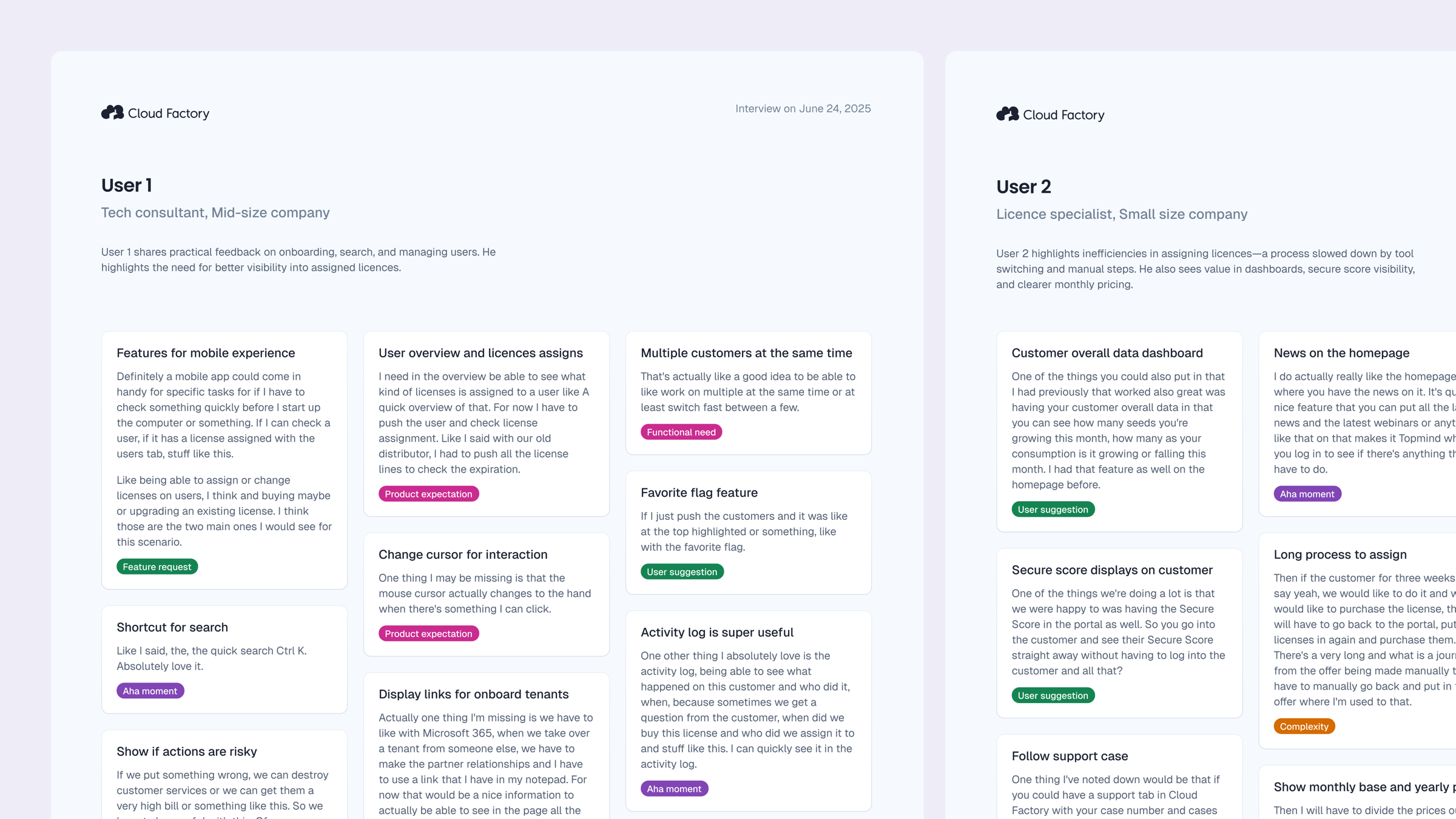
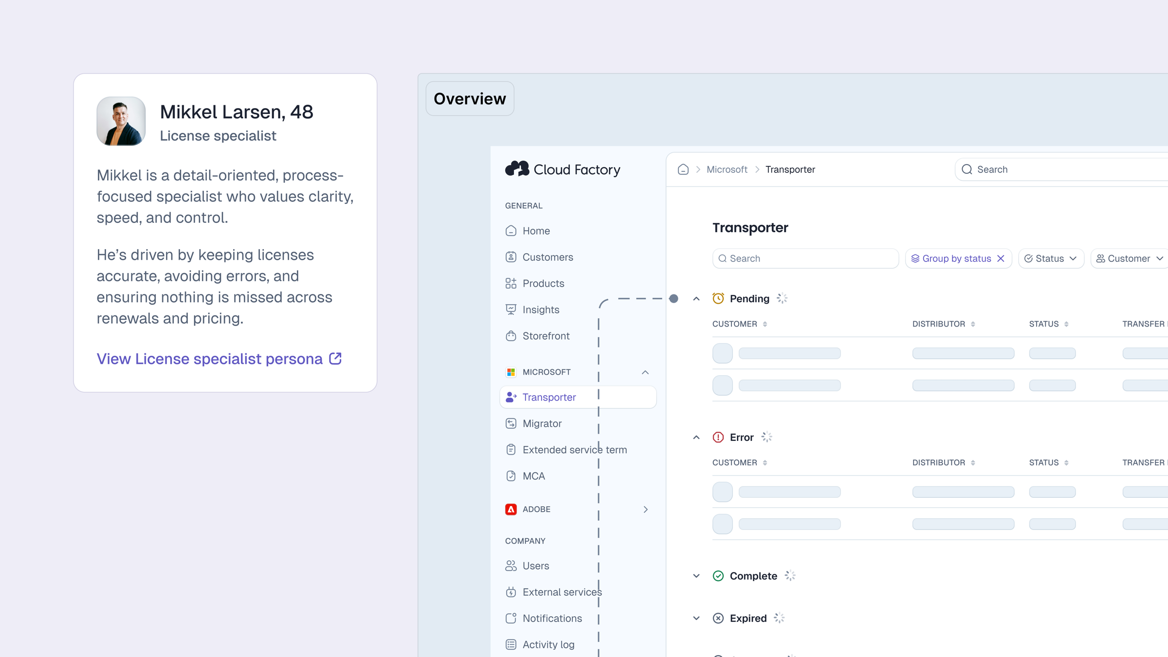
We conducted interviews with MSPs and the partner care team to understand how different people used the portal day to day. One thing that became clear quickly: not everyone had the same picture of who the users were, or which flows belonged to whom.
We built a set of personas and mapped each one to the flows they relied on. The goal wasn't just to document users — it was to give the whole team a shared reference, so design and product decisions could be grounded in a specific person with specific needs, not a generic "partner."
Process
Three problems worth solving well.
Story 1Building for what comes next
The existing product had no shared component library, no token system, and no visual consistency across pages. But the harder constraint wasn't fixing what was there — it was designing for what was coming. Cloud Factory was expanding its vendor catalog and entering new markets, so every decision in the design system had to hold up across different product flows, different contexts, and different moments in a partner's journey.
That meant thinking in patterns rather than screens. A component that works for a Microsoft subscription flow has to work just as well for an Adobe or Acronis one. We built the system to be vendor-agnostic from the token level up, so adding new products wouldn't mean rebuilding the interface each time.
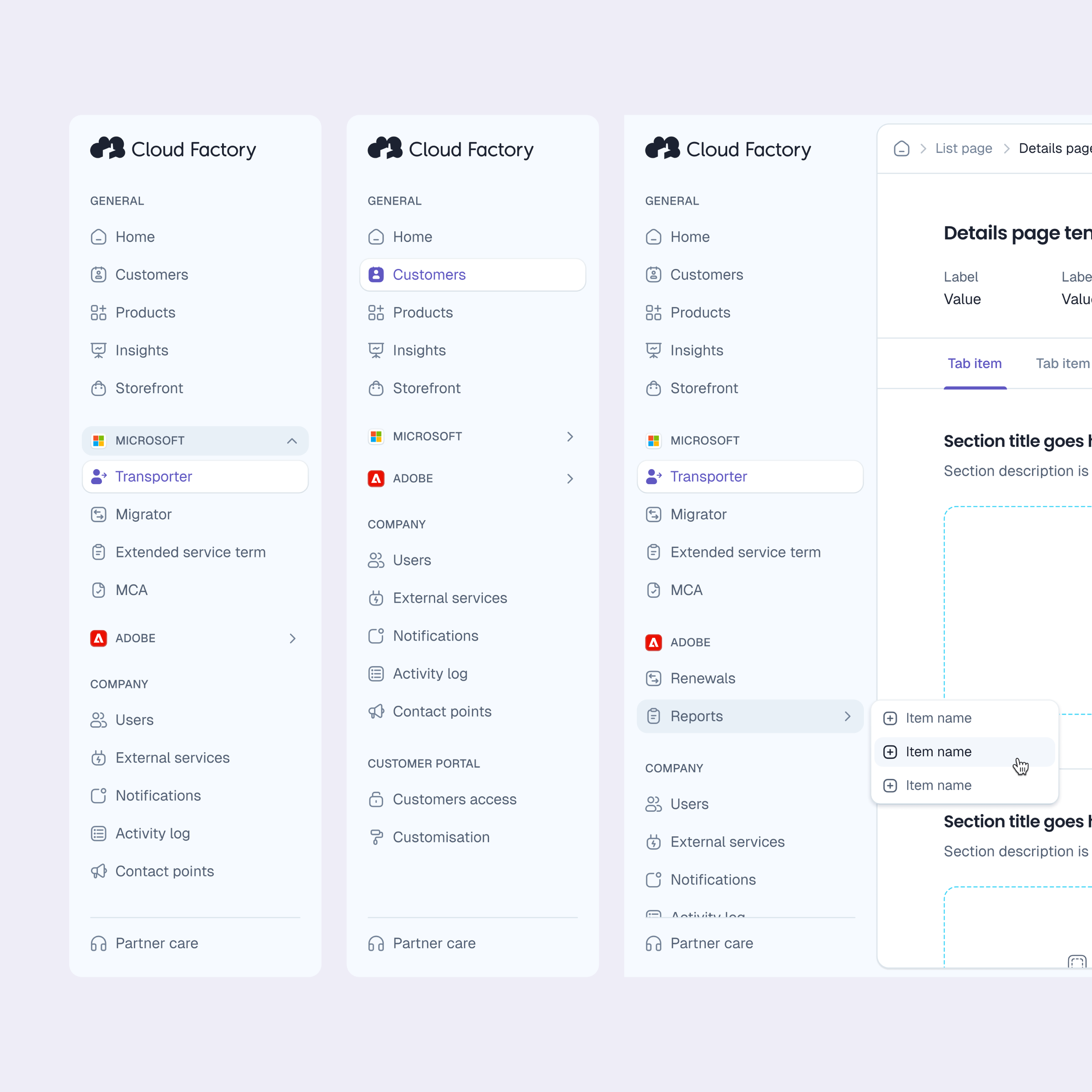
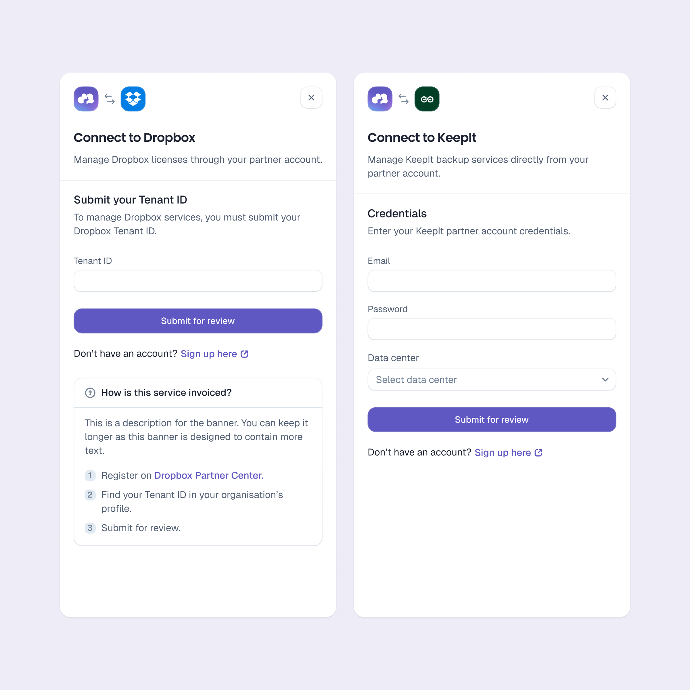
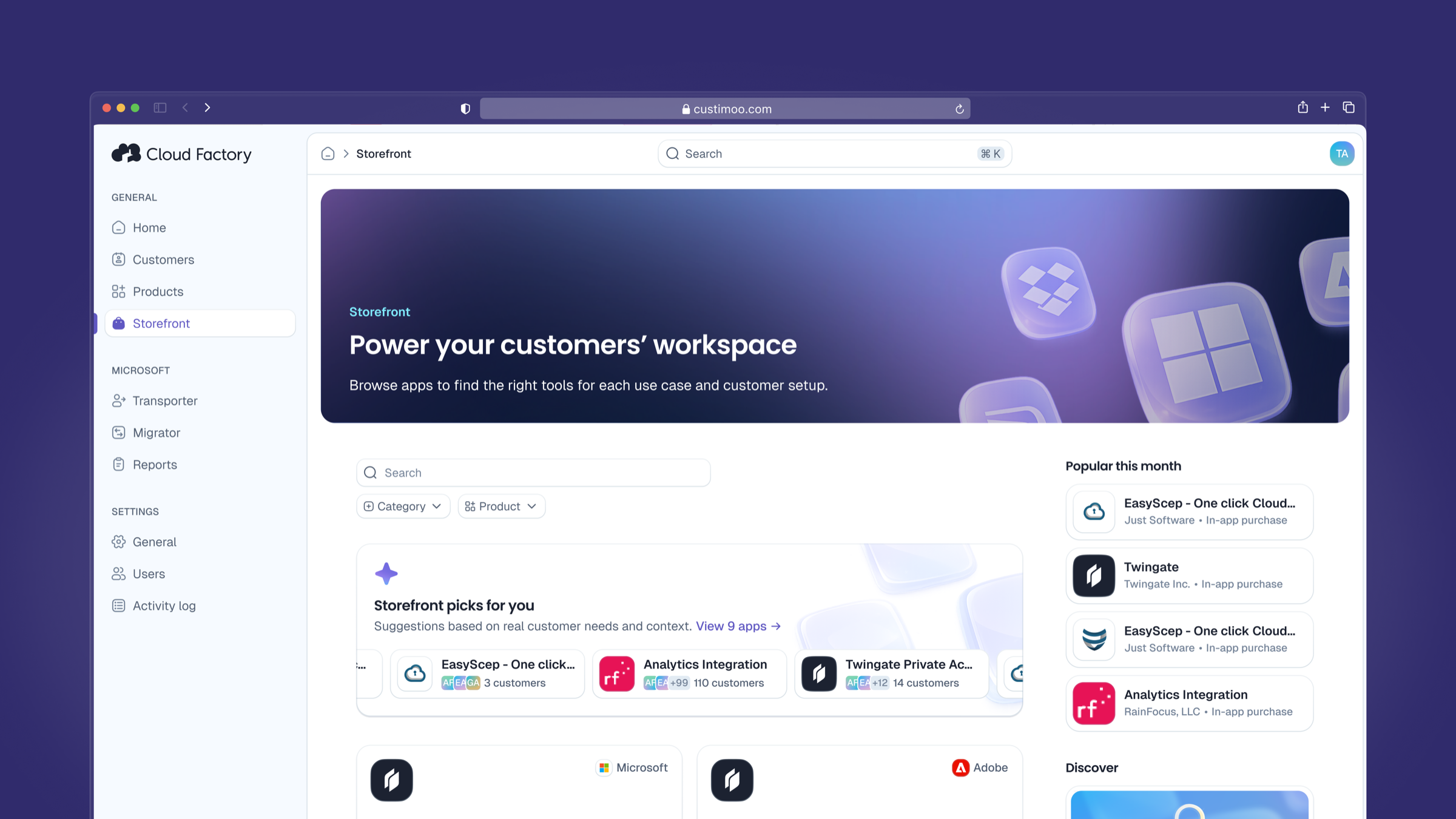
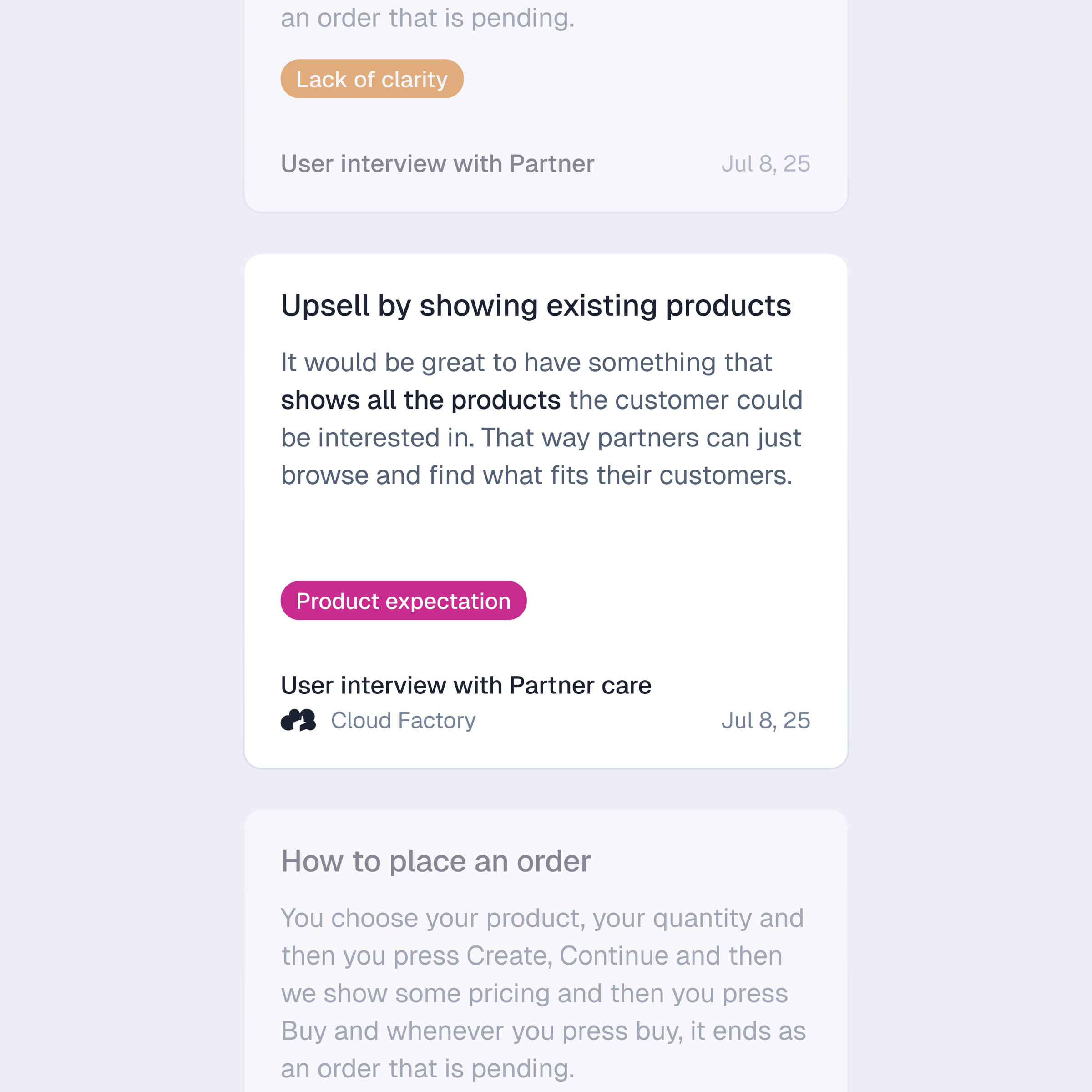
Story 2Giving partners the keys to upsell
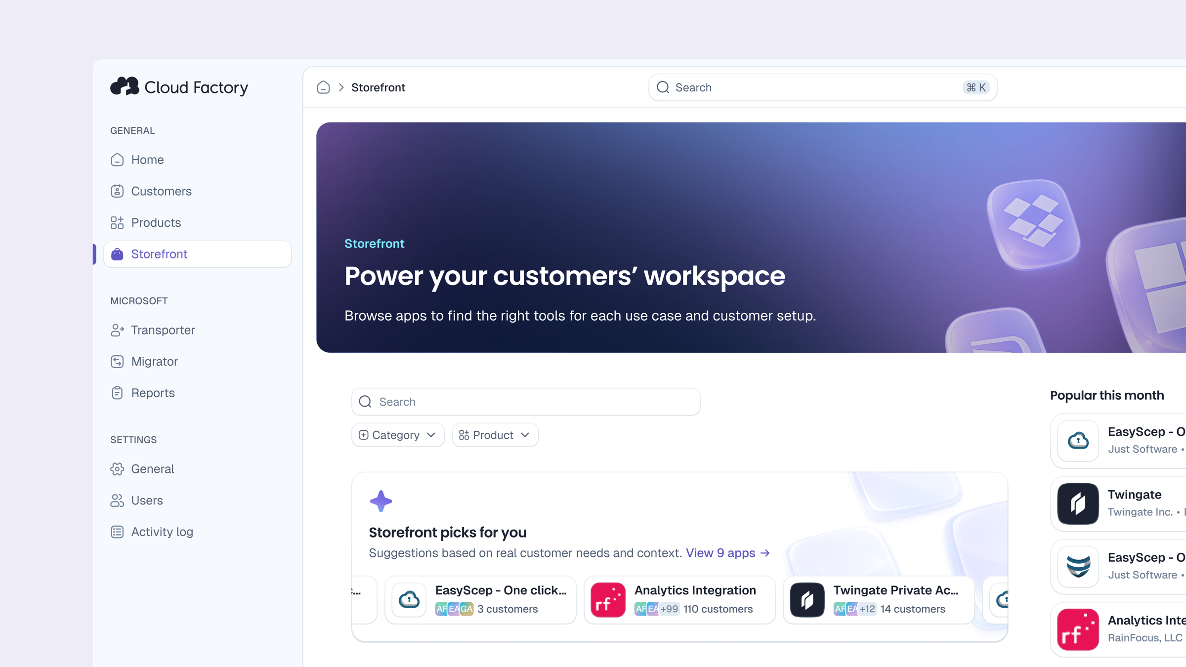
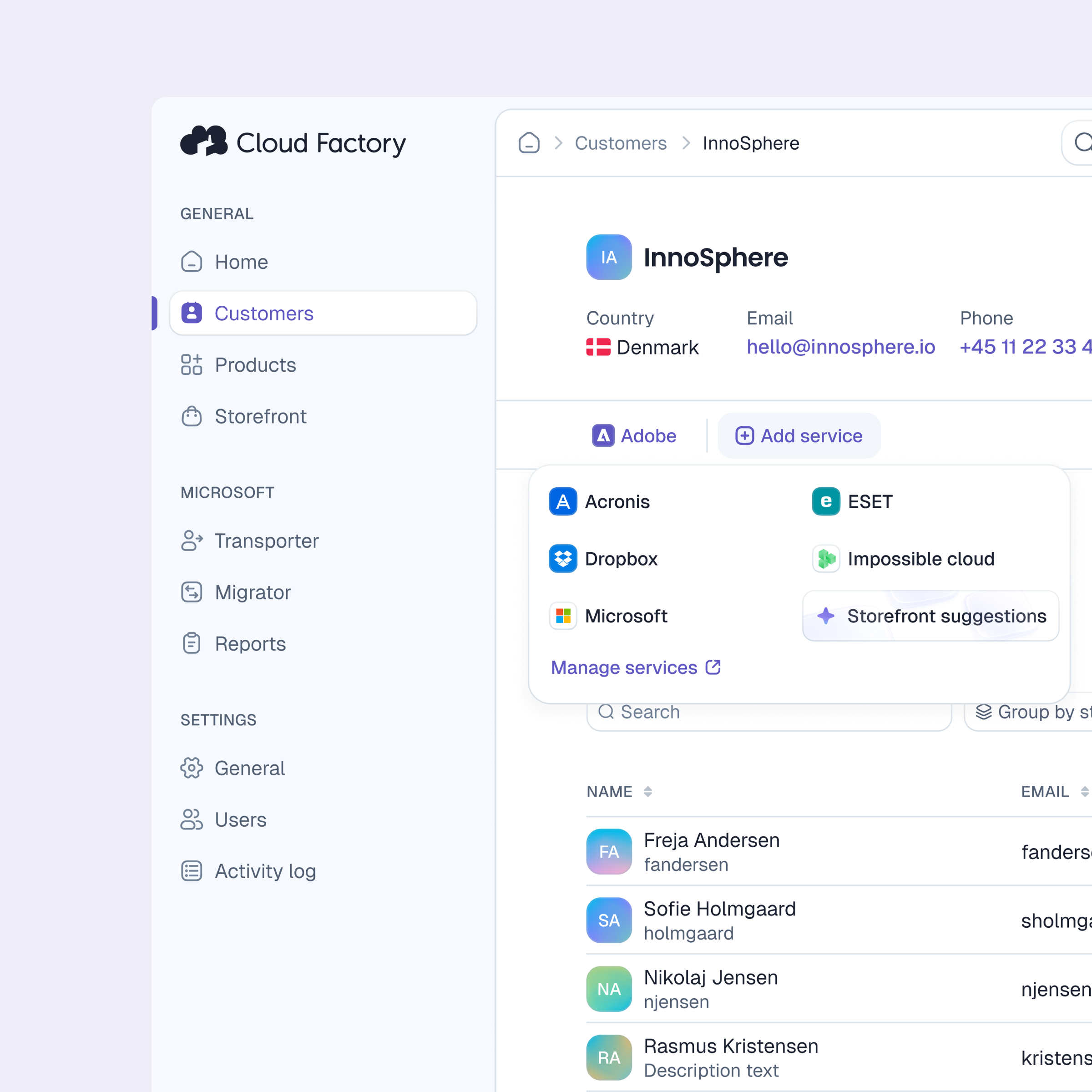
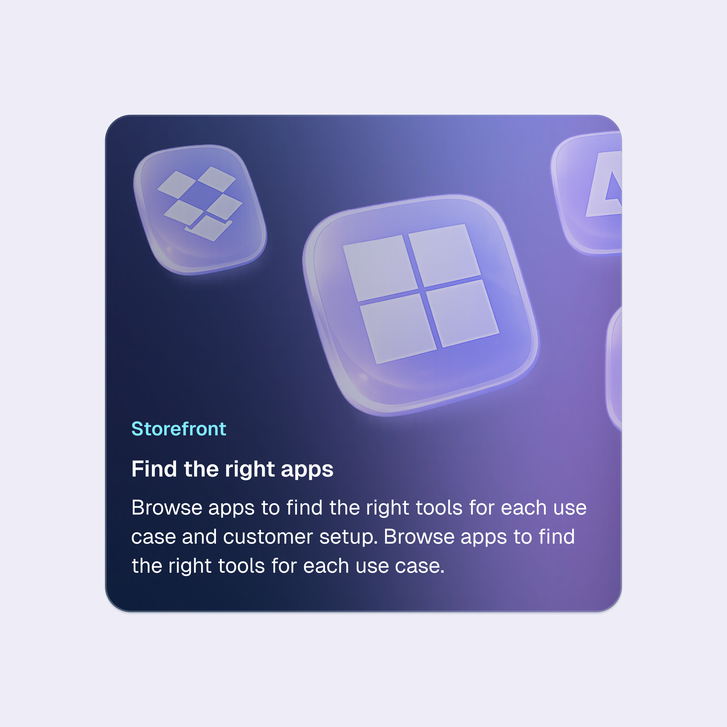
Interviews with both MSPs and the partner care team surfaced the same issue: partners often didn't know what was possible. They'd come to the portal with a specific task in mind and leave without discovering products that could have been relevant to their customers. The question became: how do we help a partner understand, at a glance, what they can offer and who it's for?
We designed a Storefront: a structured space where partners can browse the full catalog by need, not just by vendor. An AI-powered suggestion layer was added to surface relevant products based on the partner's customer profile, reducing the gap between "I don't know what to recommend" and a concrete upsell opportunity.
Story 3An overview that actually gives you an overview
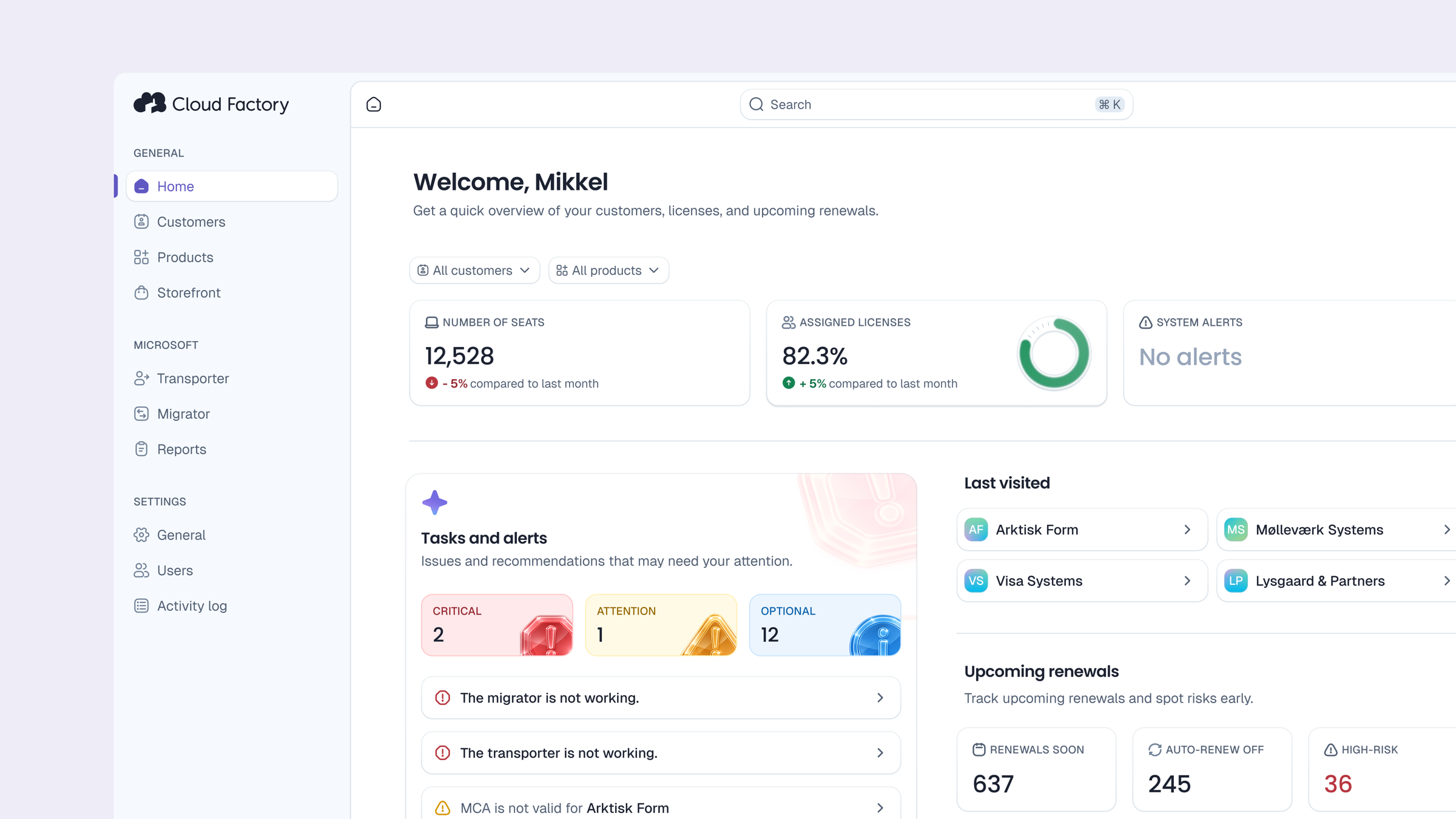
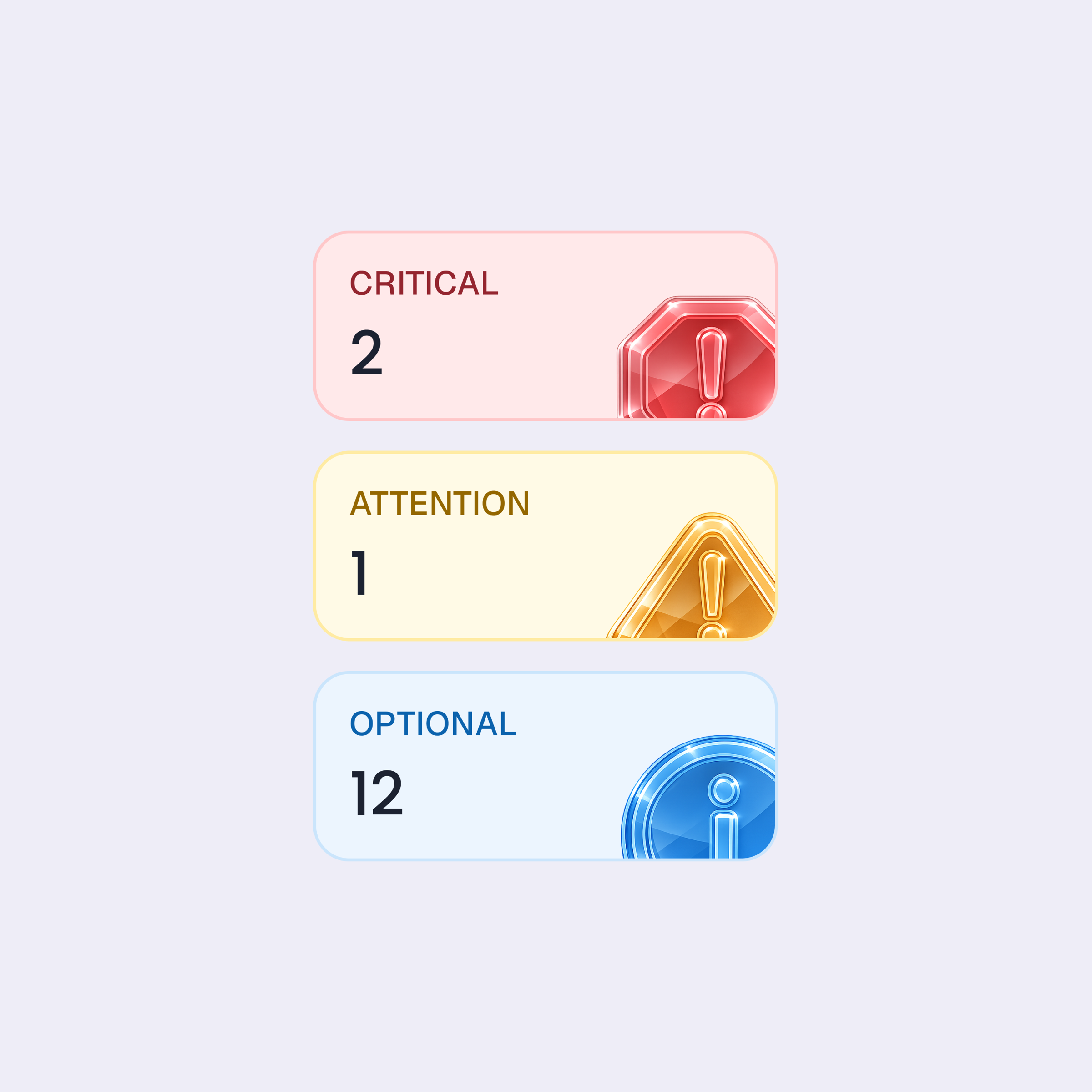
Partners landing on the portal had no single place to understand the state of their business. Subscriptions, renewals, support requests, and billing information were spread across separate sections. We redesigned the Dashboard to give partners a real-time view of what matters: active subscriptions, upcoming renewals, open service requests, and quick access to the actions they take most often.
Handoff
Designed in, not bolted on.
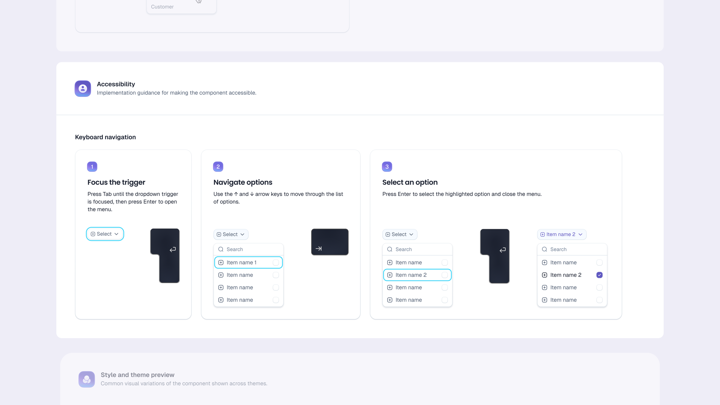
Accessibility was a deliberate part of the design system work, not a checklist at the end. Color contrast, focus states, and interactive patterns were defined at the token level to meet WCAG AA standards, so every component built on top of the system inherits those decisions by default.
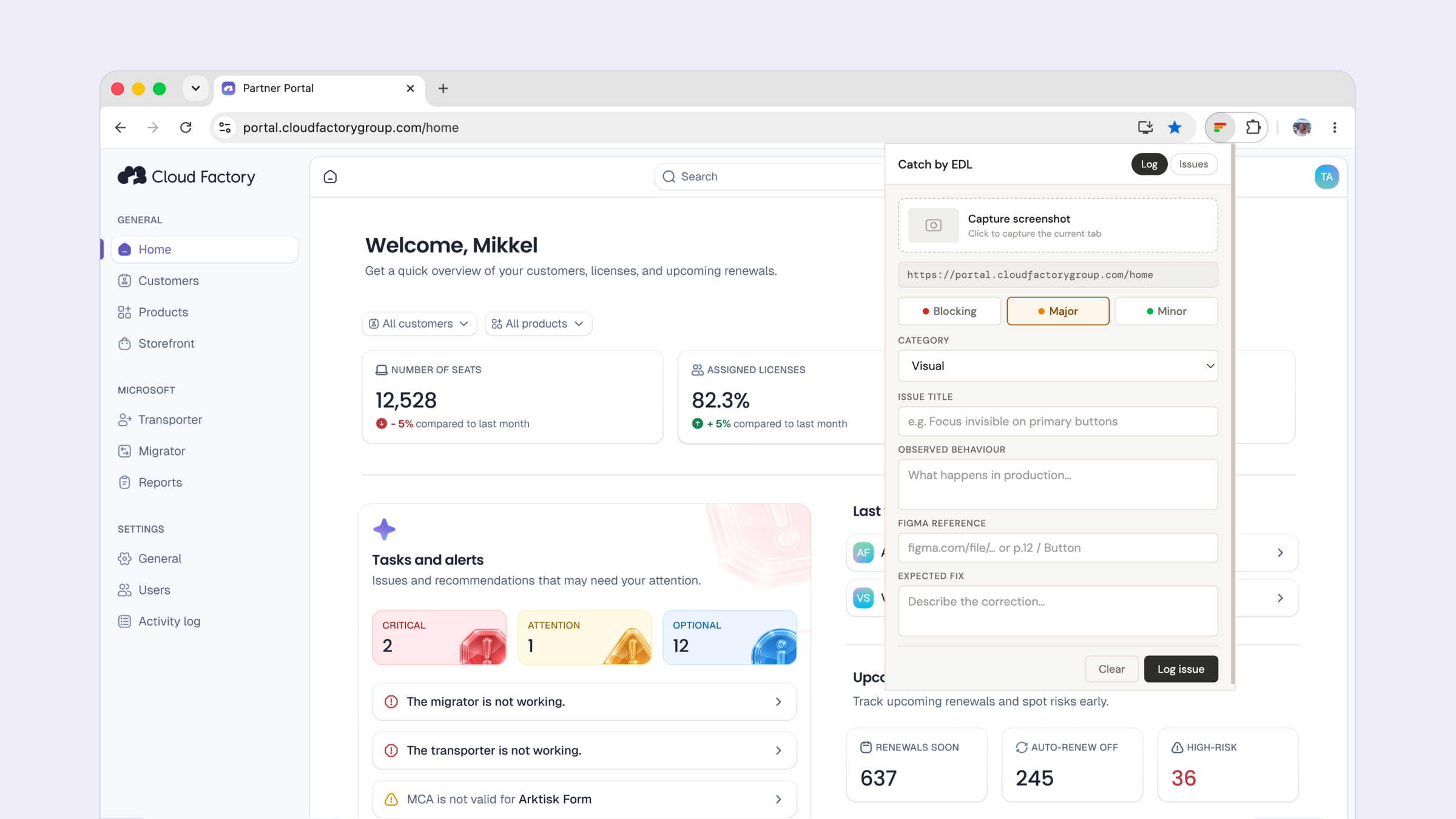
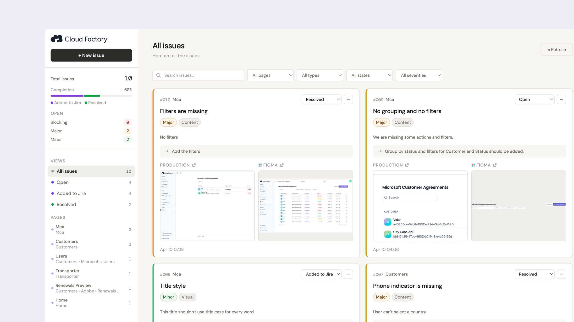
To support handoff and review, I also built a small desktop app with a Chrome extension. It scans the screen, lets you attach a Figma link and a description, and compiles everything into a structured report you can hand directly to a developer or a PO.
Outcome
The project is ongoing. The design system is being implemented progressively as the new portal rolls out to partners.
The broader ambition is a portal that grows with Cloud Factory's catalog, serves partners across 8 markets, and positions the company as a product-led distributor rather than just a licensing layer.